visualLanguage
ITP 2016 Winter Show Proposal /
Expressive Words /
From top to buttom. Serif: Cinzel,Cutive Mono, Cardo. Sane Serif: Bungee, Confortaa, Baumans
Also, I used this tool to compare different fonts: https://typezebra.com/
This week assignment is divided into two sections, the first half are expressive words, this are words that by using font and cleverness define themselves.
The second half is more an exploration on fonts, in particular the assignment challenged us to find three serif and three sans serif fonts with which we feel identified.
Visual language- Signs /
Having spend many hours in fabrication shops I have seen many warning signs. From pinching fingers to very loud noise signs. They often tend to be a little gory, I guess it is part of the processes of explaining you why you should or should not behave in certain way.
Out of all of them, the Haas caution sign for their lathes is my favorite.
Yes it is a little explicit, do you really need flood squirting everywhere?
The reason I like it is because it illustrates something not particularly obvious, having too much unconstrained stock can be fatal.
I am sure that if you are the operator and saw the sign, next to your exposed stock, you would think it twice before powering the thing on.
With shops in mind I decided to go take a look at our own ITP machine shop...
Entrance to Shop
Ten feet away and the experience starts becoming overwhelming... Not sure what is going on but it looks like there is even a crying baby! Aragorn is also trying to tell me something, most be important.
Safety Goggles... Got it!
What is on that sign half way falling apart?
Is there someone bleeding inside? Can't really tell, can't see through all the signs.
You get the idea...
Shop Signs
After gathering the courage to walk inside my fears materialized once again.
Is there really a sign behind the blinds??
Lets just focus on the machine for a minute.
Just as you walk towards it you are presented with an ocean of information. What should you focus on? I guess that if you have time you might read them all...
I have time, so I did, turns out the diagram repeats what the instructions at the top say. You also have some info on what materials to cut on this machine, that is useful.
They also tell you not to feed the material too fast... but what is too fast to begin with?
Ahh! Almost forgot... Turn the dust collector on!
Lets be a little constrictive here, how can we share all this important information in a way that is more efficient. Here a stab at it, not saying it is perfect but might be a place to begin.
Other thoughts on what makes a good or bad sign.
The Skull and Crossbones

The Skull and Crossbones, perhaps one of the most recognized symbols for keep out, danger, poison...dead. A couple of years ago I was listening to Roman Mars in his podcast series 99% Invisible. For those of you not familiar with the podcast, Roman Mars and his small but amazing team share incredibly crafted stories, mostly on topics of Design and Architecture.
On episode 114, they share the seemingly impossible task of waring future generations about the dangers of a radioactive waste dump. The challenge being that they have to warn them for the next 10 000 years!
They first start talking about language and how it changes so fast through generations. How we have such a hard time trying to understand Shakespeare, that being just from 200 years ago. Now imagine how meaningless our language might be in 10000 years.
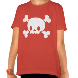
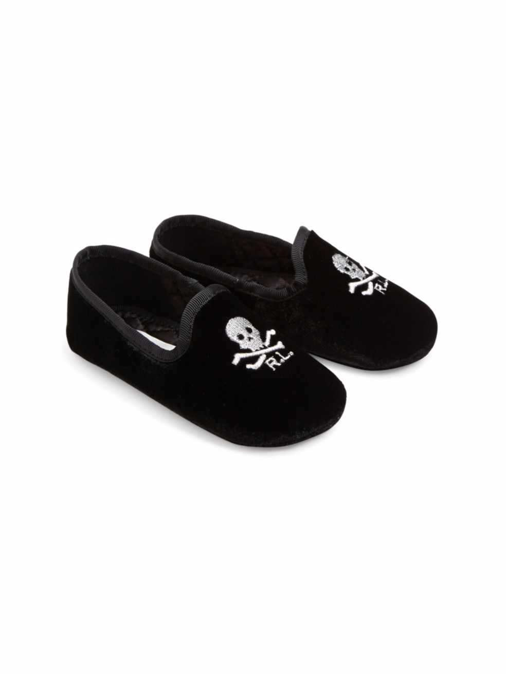
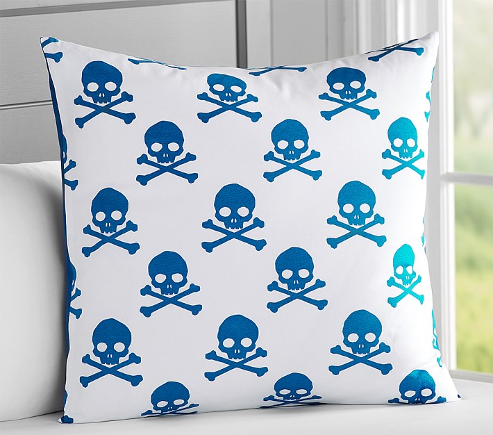
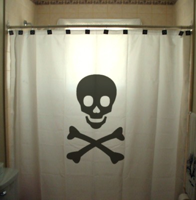
Then they start looking a symbols and diagrams. They soon realize as well that this also are victims of time and culture. For example, the Skull and Crossbones. Once a symbol for resurrection, then a symbol for dead and danger. No a meaningless symbol that you can find on basically anything:

I won't spoil the end of the podcast because the story is quite amazing.
The reason I included this as relevant is to show the importance of context in design. How something that previously was good design is no longer so. In other words, how it has lost the ability to transmit a message clearly.
If good design can stop being so, is there such thing as good design?
ANALYZING VISUAL LANGUAGE /
THE GRID
Lets take a look at what happens if we sub-divide the poster in equal segments.
You know what? Lets take a closer look...
Yep, this most have been intentional...
What is important?
I believe the grid in this poster also helps to accentuate what is important here. You have Steve Zissou/Bill Murray dead center, everyone else in second plane, slightly offset form the line.
Perhaps the second thing you notice is the title of the movie, BIG YELLOW letters also well aligned with the grid. Take a look:
Keep gazing downwards... With who? Steve Zissou? I wonder who that is? Perhaps.... Wait what? There is a fish? Oh!!! They are under water, in a yellow submarine!!!!
I am starting to believe I know what this movie is about.
THE TYPEFACE
Two different fonts, both same color. I am actually not quite sure if they are really two different fonts, they both have the same general shape, the curves, sans serif, the perfectly round O, the E who's sections all go all the way. I don't know much about fonts but there might be something here.
THE COLOR
All in dark shades of green and yellow, very underwater... Wait, I see some red, you see, their red caps, there most be something about those.
FINALLY, FOR THE FUN OF IT
Apparently, Wes Anderson is famous for his perfectly framed shots, someone actually took the time to make this amazing video.
Enjoy!
and...
Thanks for reading!