Programming the board by Sebastian Morales

The foot pedal was being used so I ended up using the fancy pick and place machine. 

Heated the board a little...

BEAUTIFUL! Actually two of my resistors are connected together but after looking at the diagram you know that this are connected regardless. In other words, no need to worry. 

I skipped a couple of steps here, well, not really but I didn't include them in the documentation. 

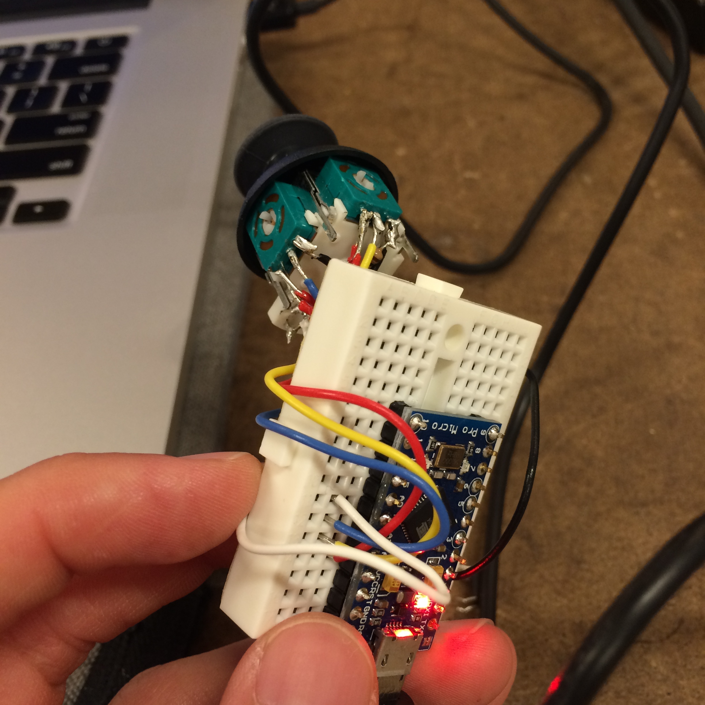
It is IMPORTANT to verify that all the components are solder correctly before connecting them to a computer, to power for that matter. 

To test this grab a multimeter and verify that the grounds are connected to the grounds and nothing else. The same goes for the powers. 

Even after doing this, I was still a little nervous so I actually used a power supply instead of my computer (to power it). It turned out that all the components were solder correctly but better to be safe. 


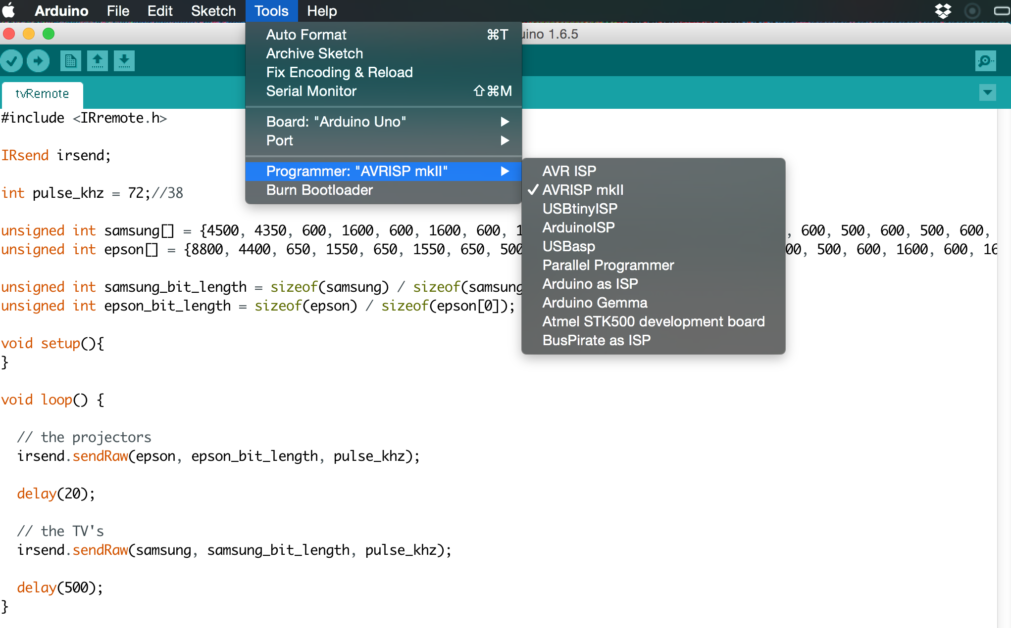
Programing / Burning the bootloader

In this case I was using the AVRISP MKII to burn the bootloader and then to upload my sketch to the atmega. 

There are a couple of tutorials on how to do so online but I found them a little confusing. The actual process is really simple. 

First make sure the pogo pins are oriented in the right direction. The green LED should light up on the programer. 

  • Select the right Programer from the "Tools" menu. 
  • Click Burnbootloader
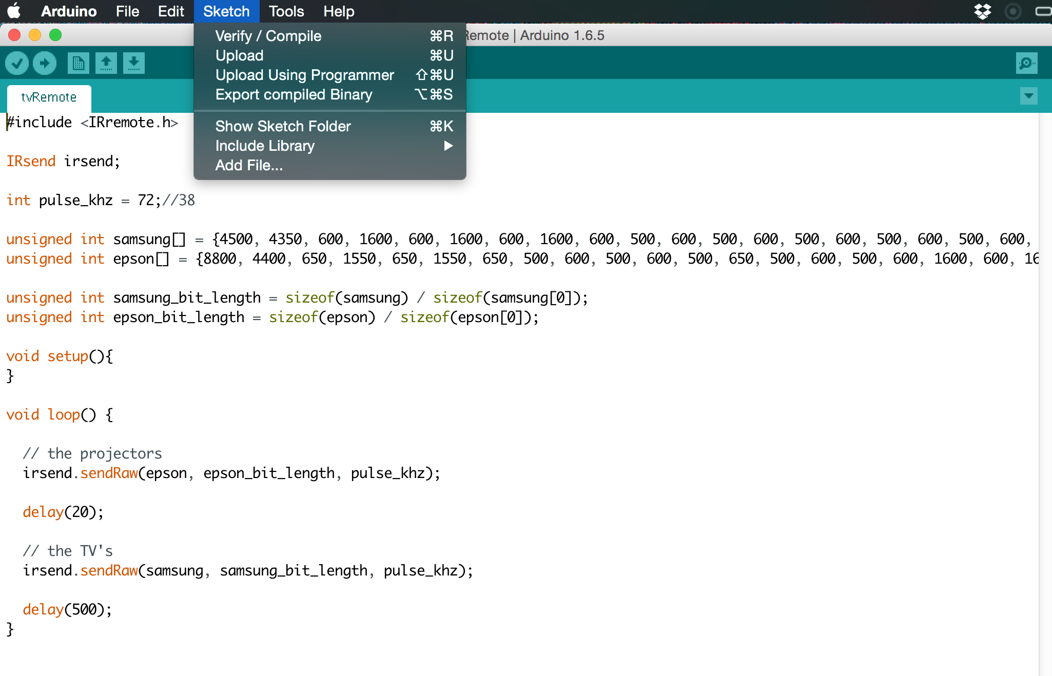
  • Upload sketch using programer (⇧⌘U)

Note: I had to change the frequency variable on the code (pulse_khz) from 36 to 72. I think I had the wrong crystal so my code was running twice as fast. After some frustrating attempts I was able to turn the projector in the classroom off.

Arduino Mouse by Sebastian Morales

A couple of months ago, while still working as a full time engineer I would have my desk filled with mice; a regular mouse, a 3D mouse, a fancy mouse, a tiny mouse, a wireless mouse... you get the idea... Although I did have one that was my favorite, I would eventually get tired of the position and switch to another one. This made me think about creating a mouse that allowed you to change positions, a mouse that would work even if you where standing upside down. 

CUSTOM SLIDERS USING P5.JS by Sebastian Morales

Having some experience with P5, I wanted to take advantage of this assignment to do something that I can reuse later in future sketches. In the past I have used the DOM elements but didn't really like the default sliders so I decided to make my own.

Ideally I would like to make some sort of library of design tools that I can just drop into projects. Although currently I don't really know how to do that. 

Using the live web editor could be a life changer, it definitely made embedding my sketch on squarespace a lot easier.  After trying to do it for almost 1h in the traditional fashion I gave up and embed it directly from the editor.

A potential problem I see with this process is that anyone can modify the content of the sketch as long as they know link, which can be easily found from the developer tools. 

ANALYZING VISUAL LANGUAGE by Sebastian Morales

THE GRID

Lets take a look at what happens if we sub-divide the poster in equal segments. 

You know what? Lets take a closer look...

Yep, this most have been intentional...

What is important?

I believe the grid in this poster also helps to accentuate what is important here. You have Steve Zissou/Bill Murray dead center, everyone else in second plane, slightly offset form the line. 

Perhaps the second thing you notice is the title of the movie, BIG YELLOW letters also well aligned with the grid. Take a look:

Keep gazing downwards... With who? Steve Zissou? I wonder who that is? Perhaps.... Wait what? There is a fish? Oh!!! They are under water, in a yellow submarine!!!!

I am starting to believe I know what this movie is about. 

THE TYPEFACE

Two different fonts, both same color. I am actually not quite sure if they are really two different fonts, they both have the same general shape, the curves, sans serif, the perfectly round O, the E who's sections all go all the way. I don't know much about fonts but there might be something here. 

THE COLOR

All in dark shades of green and yellow, very underwater... Wait, I see some red, you see, their red caps, there most be something about those.

FINALLY, FOR THE FUN OF IT

Apparently, Wes Anderson is famous for his perfectly framed shots, someone actually took the time to make this amazing video. 

Enjoy!

and...

Thanks for reading!

A VERY SHORT INTRO TO MODERN ART. COMPARISON. by Sebastian Morales

ASSIGNMENT 1:

"Write a comparison of 3 artworks from this reading on your blog. Consider the contexts in which these works were made. Please include images in your post!"

For this assignment I'll going to be looking into Robert Rauschenberg (US), Hans Haacke (Germany) and  Gavin Turk (British). In particular I'll be focusing on the work mentioned in the first two chapters of the book "A Very Short Introduction to Modern Art" by David Cottington. 

Left to right. Monogram (1951), A Real Time Social System (1971) and Bag (2000) . Rauschenberg, Haacke and Turk respectively. 

ROBERT RAUSCHENBERG

http://www.rauschenbergfoundation.org/art/art-in-context/monogram

"Robert Rauschenberg and others mocked both rampant consumerism and ‘high’ art by making use of unusual materials, including a stuffed goat and rubber tyres."-Cottington, D. Modern Art: A Very Short Introduction, Feb 2005.  Chapter 1, Page 6.

HANS HAACKE

http://www.flawedart.net/courses/publicart/haacke/haacke.htm

"Hans Haacke, in a series of documentary ‘installations’ in which he laid out the results of research he had conducted into aspects of the museums who had invited him to exhibit – material that tended to look embarrassingly like those museums’ ‘dirty linen’." Cottington, D. Modern Art: A Very Short Introduction, Feb 2005. Chapter 1, Page 7.

 GAVIN TURK

http://www.artsology.com/gavin-turk-garbage-bag.php

"Such a mismatch between the public's language of ridicule and establishment apologetics has, of course, been characteristic of the relation between modern art and its popular audience for longer now than anyone can remember" Cottington, D. Modern Art: A Very Short Introduction, Feb 2005.  Introduction,  Page 1.

This three avant-garde artists come from different generations, Rauschenberg and Haacke much closer than Turk. This is reflected in the form of their struggle/ artwork. My perspective on these 3 pieces is that the artists are trying to provoke the setting where they are place. Perhaps this is more obvious in Haacke's piece exposing the institution supporting him. In Turk's work with trash bags it is a mockery of the absurdity of art, how craft is dead, context is the only thing that matters. In that sense, fine art is not a piece of work but what happens inside a gallery or a museum.  

In a way, it seems that this amorphous monster that avant-garde artist always find themselves fighting against is much larger than they can understand. It seems like no mater the size of the effort, the monster budges slightly, and swallows it all. Stronger than before. Cottington frames the struggle perfectly explaining how "The irony of the avant-garde is that the art that was meant to sit outside of the establishment now sits firmly in it."

Who knows, perhaps they are not fighting against the establishment, but for a place in it. 

Has the monster become so big that it will swallow anything as art? From trash bags to a pair of glasses left by a teenager on the gallery floor? 


List of Artists I couldn't immediately picture multiple pieces of work in my head  (I stopped at chapter 2.5 since I wasn't going to finish and needed to read in the subway):